
Sorry, but I’m going to ask for a little help today.
I’ve been playing around with my branding, looking for a theme that feels right.
For the past few months I’ve been messing with my official website, and there are parts of it I love, and parts that I’m not sure about.
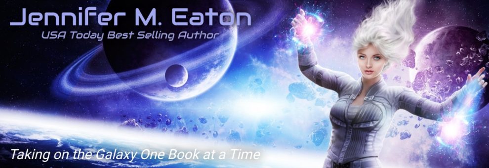
One thing I do love from my website is the banner below, which I adopted here on my blog several weeks ago
![]()
Yeah, I love it too. It’s very me, and I love the sci-fi feel. But I wanted a little more than just the banner. I wanted the “flowing” look that I’d tried (somewhat successfully) to create on the website.
But now I think I’ve finally achieved that here on my blog as well. Maybe even better.
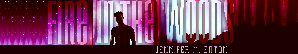
I know a lot of you follow through email, but would you mind clicking on in to the blog site today and letting me know what you think?
Do you like it? Not like it? Can you read the type over the image? What could be better? And most importantly, does it look right on your browser?
Thanks for your input guys. I appreciate it!
![]()
 |
 |
 |
 |
|
 |
 |
 |
 |
 |