
Sorry, but I’m going to ask for a little help today.
I’ve been playing around with my branding, looking for a theme that feels right.
For the past few months I’ve been messing with my official website, and there are parts of it I love, and parts that I’m not sure about.
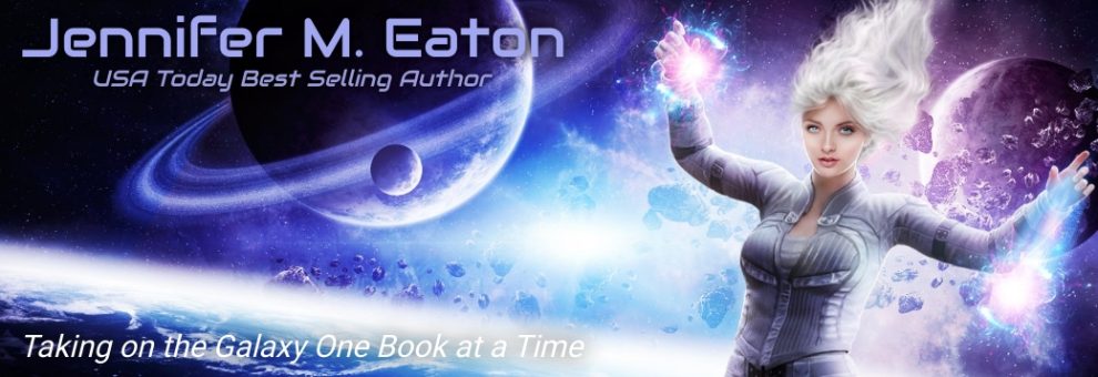
One thing I do love from my website is the banner below, which I adopted here on my blog several weeks ago
![]()
Yeah, I love it too. It’s very me, and I love the sci-fi feel. But I wanted a little more than just the banner. I wanted the “flowing” look that I’d tried (somewhat successfully) to create on the website.
But now I think I’ve finally achieved that here on my blog as well. Maybe even better.
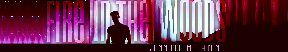
I know a lot of you follow through email, but would you mind clicking on in to the blog site today and letting me know what you think?
Do you like it? Not like it? Can you read the type over the image? What could be better? And most importantly, does it look right on your browser?
Thanks for your input guys. I appreciate it!
![]()
 |
 |
 |
 |
|
 |
 |
 |
 |
 |


Your name shines, but the letters are still distinguishable. I like Fire in the Woods next to your name banner or on the side of your blog instead of directly underneath your shining name banner. Yes, it looks sci-fi and other worldly, but Vanessa-Jane is correct. I can’t find the fact that you’re a writer either. Good luck with everything. You are an accomplished writer, and I am thrilled to know you.
Plenty of good feedback above. Lots of white on the right. Cheers —
Hi Jen! Yes Firefox and Chrome (in fact any browser) will show a white strip down the RHS of a screen wider than 1050 pixels. This is because the background image is 1049 pixels wide and the web page is not set to “tiled” the background in either the vertical or horizontal directions. Looking at the design I think it’s not supposed to tile vertically but it probably should tile horizontally. The actual graphic should be designed to be seamless so when you place it next to itself you can’t see the join. I don’t think yours is. It also seems to have a long fat line of white text that has been blurred out and is visible behind the menu bar.
The banner looks good.
I don’t see the problem with the lack or gap between the books on either Chrome or Firefox.
On Chrome (but not FF) your fish are swimming over the comments!
I hope this helps!
Richard.
Love the stars and sky on the left – but that broad bright white band on the right keeps drawing your eye that direction.
Banner looks good – no problem to read it.
(The “Sorry” and face are pretty cute)
Broad white band – that’s a new one. So weird how it looks different on everyone’s computers. Thanks for the info!
Looks great … apart from that pesky white stripe on the right side
Where stripe? Gah! I don’t see a white stripe.
When I open it, it looks great, but the starry sky doesn’t go all the way across. It hits the corner of the page on the left, but on the right, there’s almost a 2 inch gap of just white that’s jarring, since it doesn’t continue across the top. I’ve tried refreshing it, and it’s still doing it.
I’m in Chrome, I don’t know if that makes a difference.
Chrome? Thanks. Let me check in that. Several people see a stripe the I can’t see.
Could be Chrome, that’s what I’m using. It’s as though there’s a third column on the right that’s empty.
Love the banner. And the website. And blog.
I like the look and how it carries from page to page. Well done!
I think it looks pretty good. I would actually split up your two books. Since Ashes in the Sky is coming out soon, I would make that a focus. Something like, “Coming Soon! The highly-anticipated sequel to FIRE IN THE WOODS!” then maybe a brief description – “Join, David and Jess on their next hair-raising adventure that will have Earthlings scrambling for cover, and aliens vying for power.” or something like that. Beneath that I’d put FIRE IN THE WOODS with the description.
Tim Grahl suggests to put a brief bio about you on the front page so others know what and who you are. I agree with Vanessa on that point, even if you put in small letters beneath your name, “Author”.
The box for “Who is this lady?” that has Believe written in it? It doesn’t seem to go with the question. Can you incorporate a picture of you in there? Vignette/soften it so it looks really cool and space-like? I think that way your visitors can see you right off the bat and they want to know “who is this lady?”
On your books page, I would again reiterate ASHES IN THE SKY first with a COMING SOON above/beside it, then keep the rest of the books the way they are.
Looks great, kid. Love the color scheme and theme you’ve got going on.
I like it. A few small points…
– You don’t actually say anywhere on that home page that you’re an author, that it’s an author’s website. Your name is on the covers of the two books, but people might not look at that. And down the bottom on the link for books it says “Check out more books from Jennifer M. Eaton”, so by that time it will be obvious, but I think it needs to be clear right from the top of the page. On this blog page it’s more obvious because it says you’re an author right away under your photo on the left.
– I think it would be good if there was a small gap between the two books, Fire in the Woods and Ashes in the Sky. That might be a browser issue on my Mac here, they’re stuck next to each other with no white in between as I see them. Also, it would be good to mention Ashes in the Sky at the end of the blurb there as you have a picture of it, just something like “Hold on for the ride of your life with Fire in the Woods, and its sequel Ashes in the Sky”.
– Is it deliberate that the top banner is wider than the rest of the page. If so, I can’t work out if I like that or if I think it would be better the same width.
I’ll check on a PC later to see how it compares looks-wise to on my Mac.